
Project Budgeting Tool
How I enhanced a tool's usability to help business facilitators manage their budgets

Overview
Here's a quick summary of the product I worked on and my role on the team.
The Product
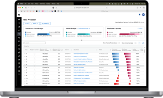
IS&T business units use a proprietary tool to propose project ideas and select which ones receive funding for the upcoming fiscal year.
My Role
As a UX designer, I was responsible for the end-to-end redesign of the project budgeting tool, from user research to handoff to development. I worked closely with the product manager and developer to ship this new solution.
Role
UX designer
Team
Product manager
Business director
Software developer
January 2025 -
Timeframe
The Problem
The current solution presents data in a way that makes it challenging for users to allocate and manage their budgets.
Business facilitators must have a clear grasp of their current budget to effectively select which project ideas to prioritize. The current solution presents information in a way that obscures the budget, and its unintuitive interactions limit the ability to effectively prioritize project ideas.
The User
In order to make informed design decisions, I focused on learning about the needs of business facilitators.
Through user interviews, I uncovered the key questions that business facilitators have on their mind when they come to this tool. They rely on the answers to these questions when selecting which projects to fund for the upcoming fiscal year.
With a budget of $X, which ideas could I fund?
If I selected these X ideas, how much would that cost?
How much budget do I have left after funding these X ideas?
Usability Issues
I uncovered some of the key painpoints users have with the existing solution.
Through talking to users and dissecting the current solution, I discovered some of the key interactions and visual issues that make this solution challenging to use.
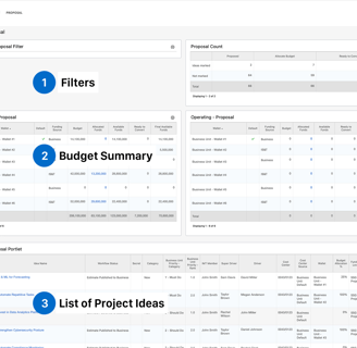
I focused on the 3 primary parts of the tool and listed out the usability issues with each.
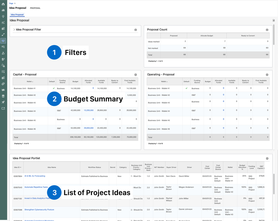
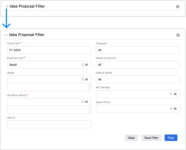
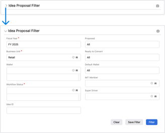
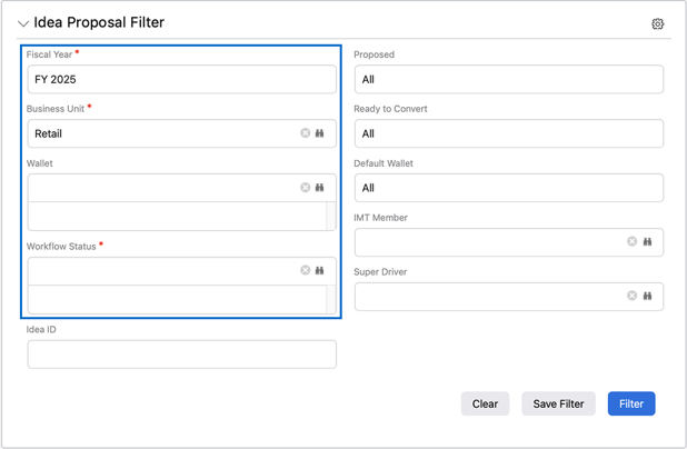
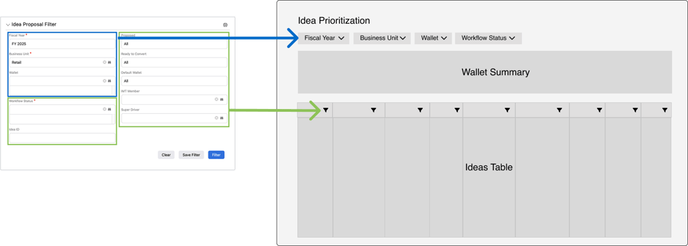
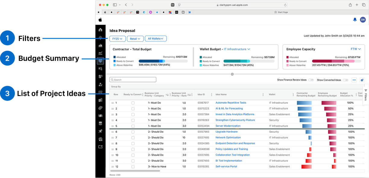
#1 - Filters
Issues
Large quantity of fields is overwelminjg
Not immediately obvious which fields are mandatory
When the modal is collapsed, active filters are no longer visible
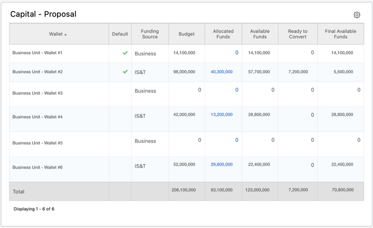
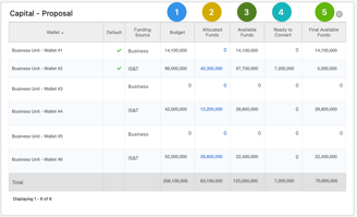
#2 - Budget Summary
Issues
Scanning rows and columns requires significant effort and is prone to user error.
Excessive text makes it hard to digest at a glance
Not easy to visualize each part's contribution to the total
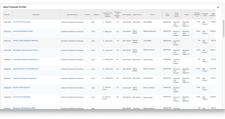
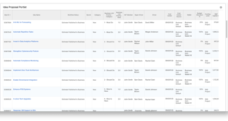
#3 - List of Project Ideas
Issues
Key financial columns are positioned on the far right, requiring excessive horizontal scrolling to access
Budget summary falls out of view due to the limited page height
The interactions needed to progress project ideas are neither accessible nor intuitive
Ideation
After identifying the usability issues, I began ideating solutions.
I quickly realized that users are presented with a large quantity of data that requires a high effort to interpret and draw insights from. My key considerations while ideating were:
How can we surface the essential budget information that are used for decision making?
How can we make it easier to adjust the order of the list?
How can we make it easier to move project ideas forward?
#1 - Filters
After tinkering with the filters, I noticed a pattern.
These 4 filters, narrow down all of the data on the page, including the wallet summary and ideas table.
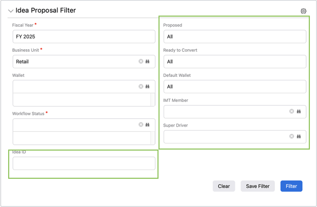

These 6 filters narrow down all of the data in specific columns of the ideas table
Instead of concealing these filters within a collapsible menu, I extracted them and positioned them above the components they control.
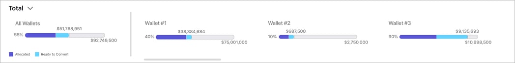
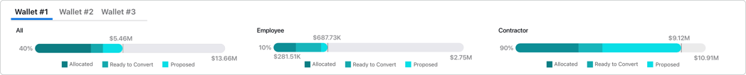
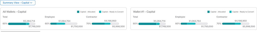
#2 - Wallet Summary
By analyzing how the values are calculated in each column, I was able to see the part-to-whole relationship between the funds and the budget.
I mocked up various types of graphs that could be used to represent the various funds and budget.


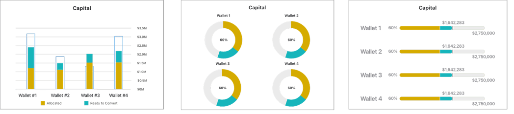
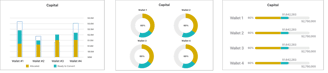
Based on user feedback, the progress bar approach aligned most with the mental model of users. Over the course of multiple iterations, I landed on a design that best conveyed how users were consuming their budget.
V1
V2
V3
V4


Position of Wallet Summary
#3 - Ideas Table
I collaborated with business facilitators to identify the most important columns and reorganized the default column order accordingly.
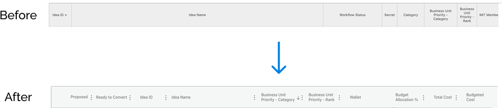
After resolving the column order, I turned my attention to the mechanism for proposing ideas—a necessary step in the approval flow.
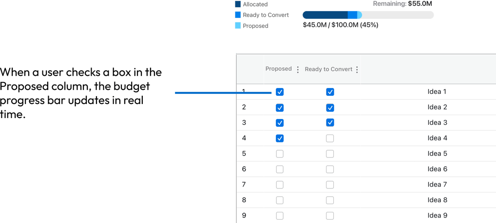
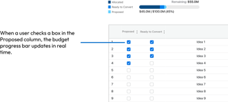
Option 1: Checkboxes
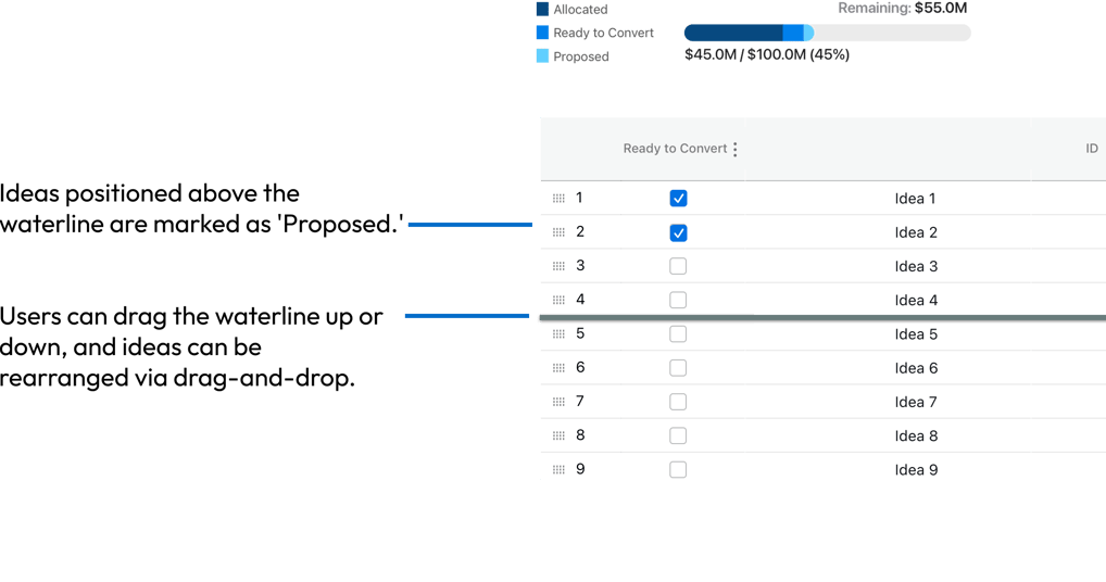
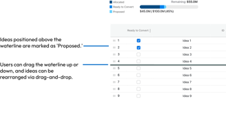
Option 2: Moveable Waterline
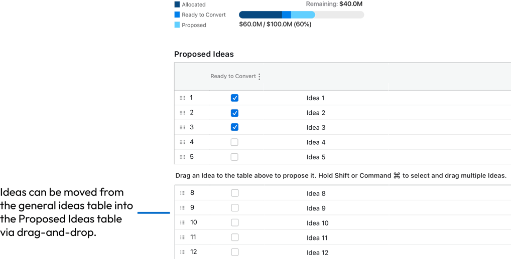
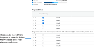
Option 3: Separate Tables
After presenting users with the 3 options, I discovered that the majority found the waterline mechanism (Option 2) to be the most intuitive and easiest way to propose ideas.
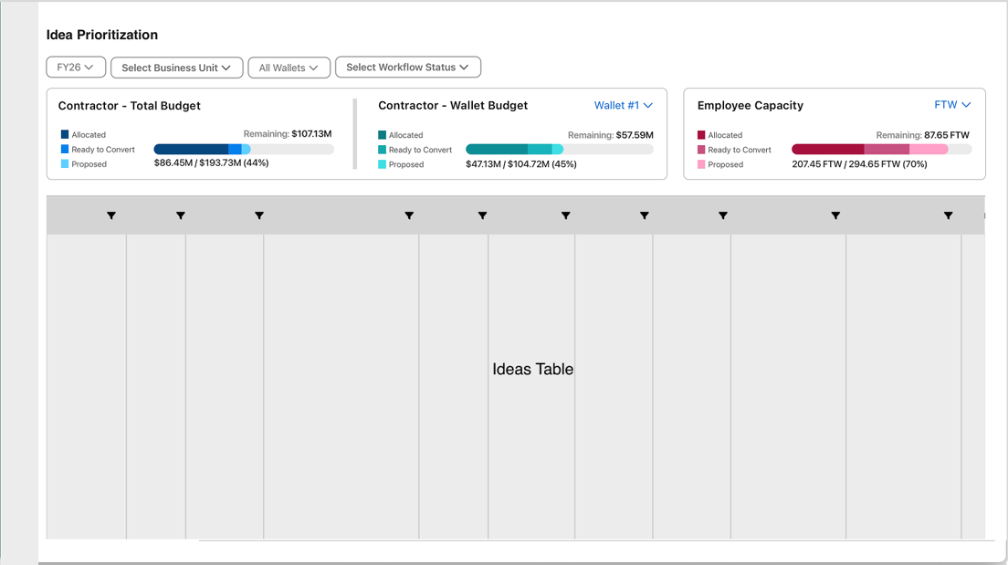
Putting it All Together
What's Next
Next Steps
Once the prototype is fully functional, I will be conducting usability tests to assess how effectively business facilitators can navigate and interact with the product in a realistic scenario. From there, I will continue to make enhancements.