Oracle LaunchX
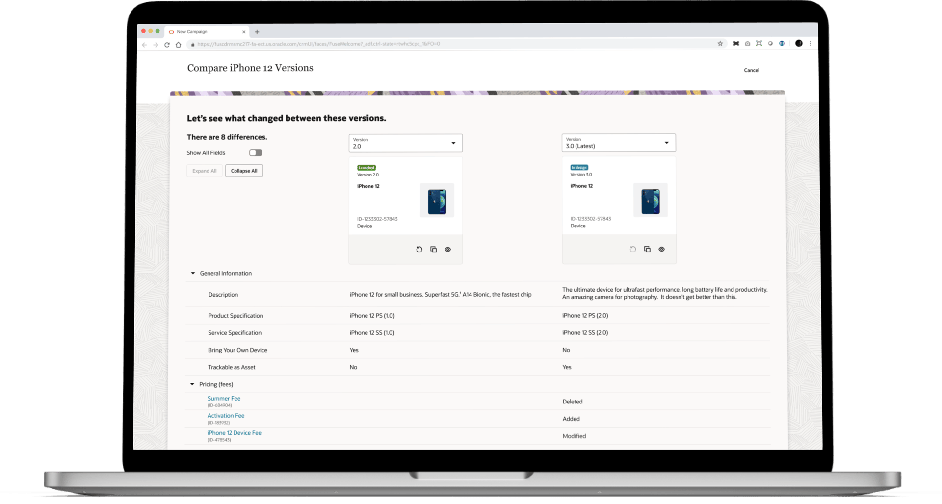
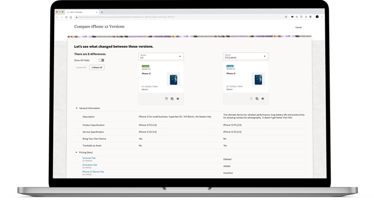
How I designed a product comparison tool to help optimize immense product catalogs
Overview
Here's a quick summary of the product I worked on and my role on the team.
The Product
Oracle Digital Experience for Communications-LaunchX is a catalog management system that is tailored to telecommunications companies. The product enables product managers to create and manage catalog offerings, pricing, and promotions in a single, intuitive interface.
My Role
As a UX designer, I took ownership of the full design process for a new product comparison feature for LaunchX. I worked closely with the product manager and developer to ship this feature.
Role
UX designer
Team
Product manager
Design lead
Software developer
January - March 2022
Timeframe
The Problem
Keeping track of changes between versions of an offering is a manual and time consuming process.
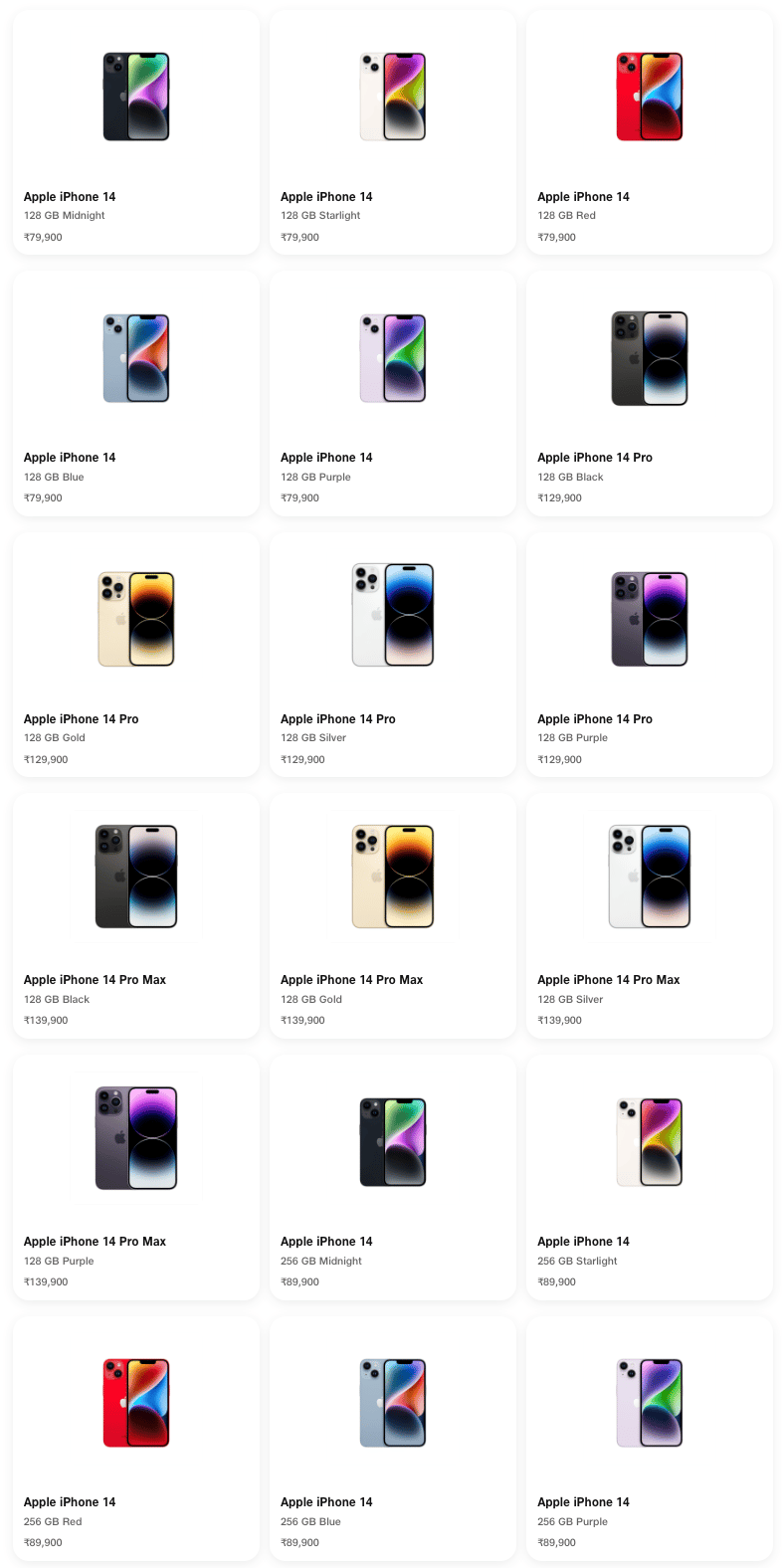
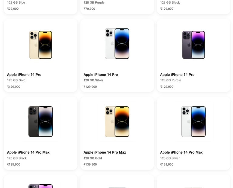
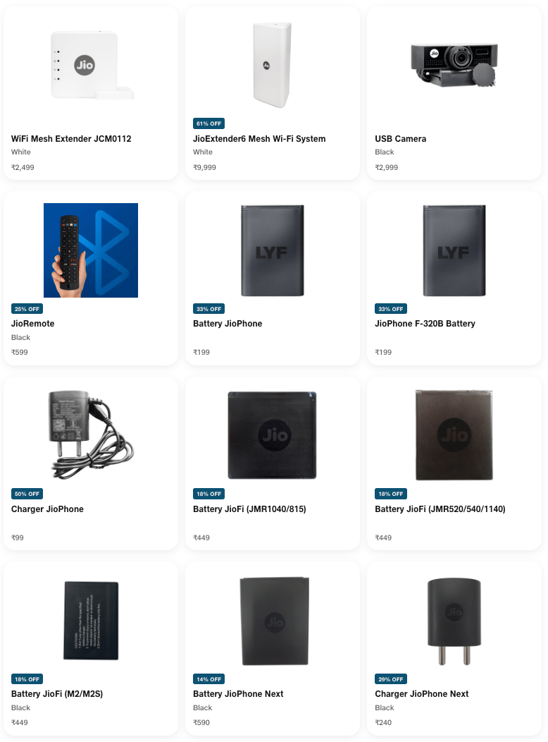
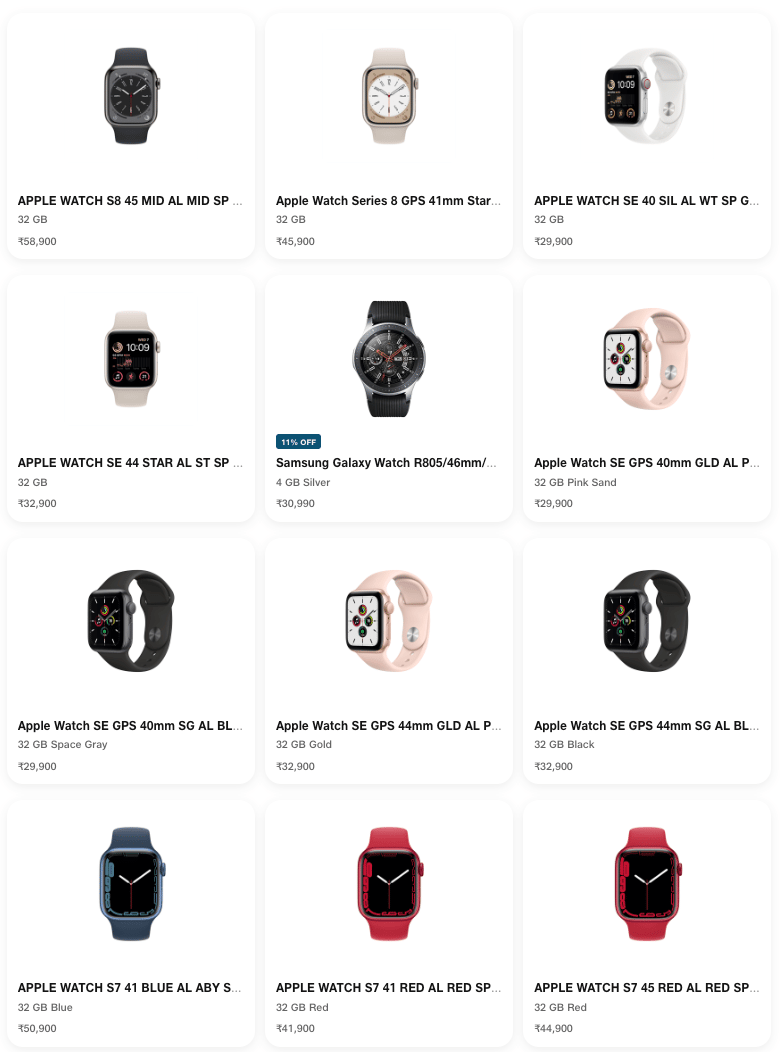
Product managers in the telecommunications industry work with catalogs that typically contain over 1000 offerings (devices, services, accessories etc.). The information pertaining to these offerings (ex. pricing, effective period, promotions) is distributed across multiple pages in the LaunchX system. To compare the differences between two different versions of an offering is no simple task. It requires either taking notes, flipping between tabs, or opening multiple browsers, which all present a heavy cognitive load on the user.
The User
In order to make informed design decisions, I focused on learning about the goals of telecom product managers.
My initial plan was to conduct user interviews with the telecom employees that the Oracle product manager had interacted with in the past. Unfortunately, the product manager was unwilling to share his contacts with me. However, because he had extensive interaction with telecom employees and a good understanding of their needs, I was able to get my user research questions answered by him. I decided to organize this information into a user persona for easy reference of the goals and frustrations that I needed to address in my designs.
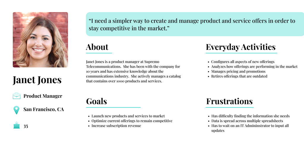

As a product manager, I want to understand what changed between versions so that I can identify and adjust the configurations that may be contributing to poor performance in the market.
As a product manager, I want to see how an older offering is configured so that I have a foundation to base the design of a new offering off of.
Understanding the Data
I realized that to design a useful comparison feature, I needed to understand what information is compared.
After being informed that product managers need a way to view what changed between multiple versions, I decided to take a deeper look at the actual data that they might compare. I approached this by stepping through the existing user flow for creating a new offering and documenting every entry field in the form. While conducting this activity, I also discovered how all of this information was structured.
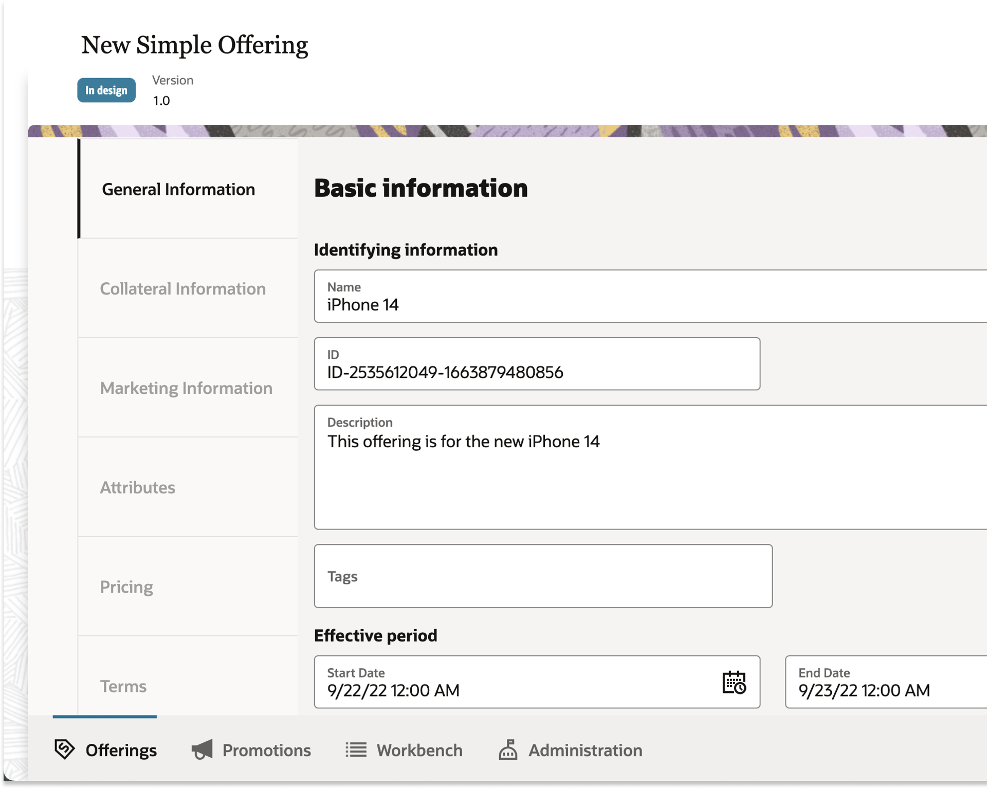
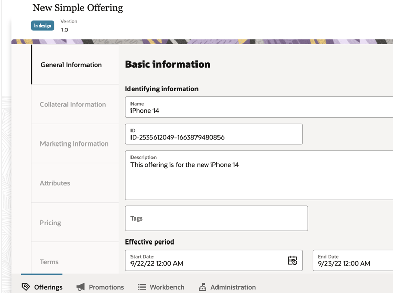
The information for an offering is organized into 6 different tabs:
General Information
Collateral Information
Marketing Information
Attributes
Pricing
Terms
While analyzing the contents of pricing, I discovered a hierarchical structure where items are linked to each other in parent-child relationships.
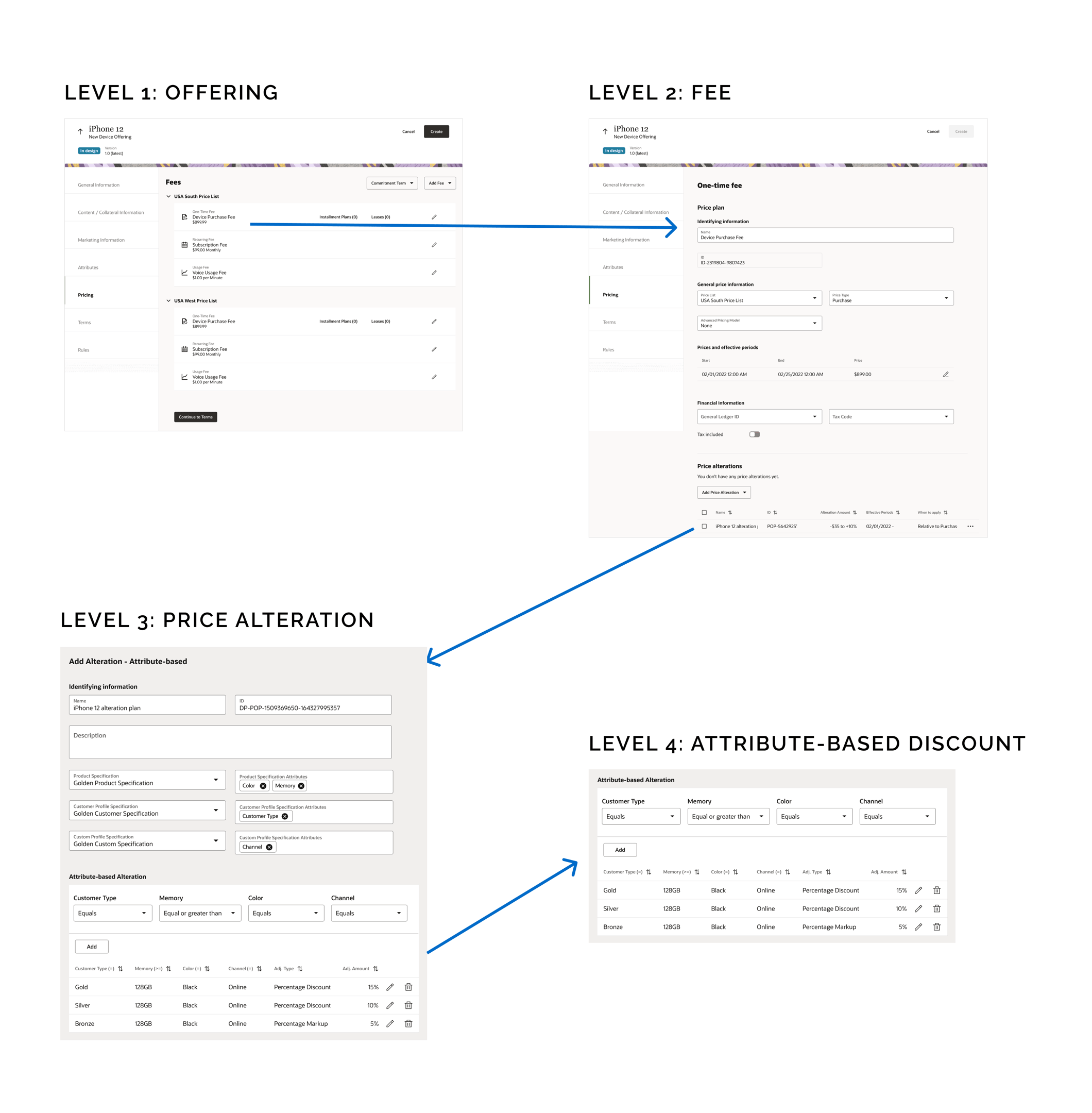
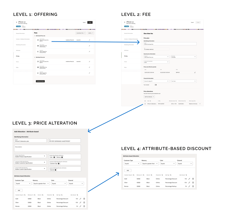
I realized that my design would need to help the user maintain context of the 4 level hierarchical structure of data.
Key Takeaways
With the 150+ entry fields documented in a single spreadsheet, I could now easily reference this information while designing.
Gathering Inspiration
To help generate ideas for how to display this information, I searched for inspiration online.
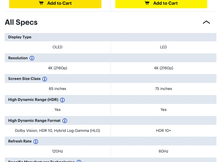
Given that product comparison tools have existed in other applications for quite some time, I wanted to understand the conventions I should follow when creating my own design. I did this by reading online articles, including one written by the Nielsen Norman Group. Some of the best practices that I discovered, included:
1. Remove identical information
2. Group attributes by category
3. Use persistent column headings
4. Use horizontal styling to define rows
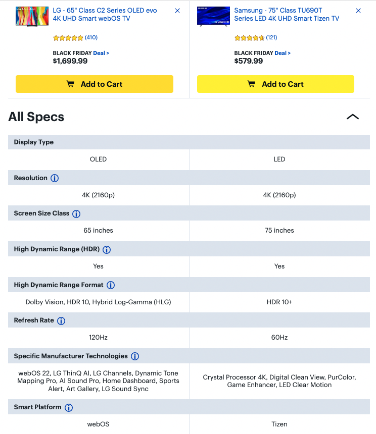
I also examined how other websites designed their product comparison tools for inspiration.
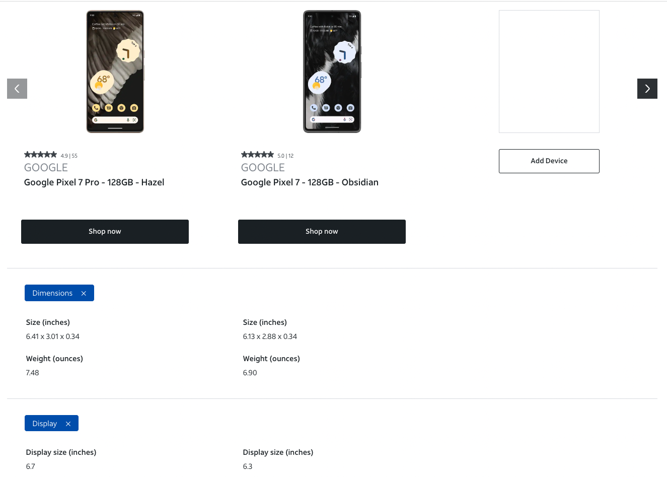
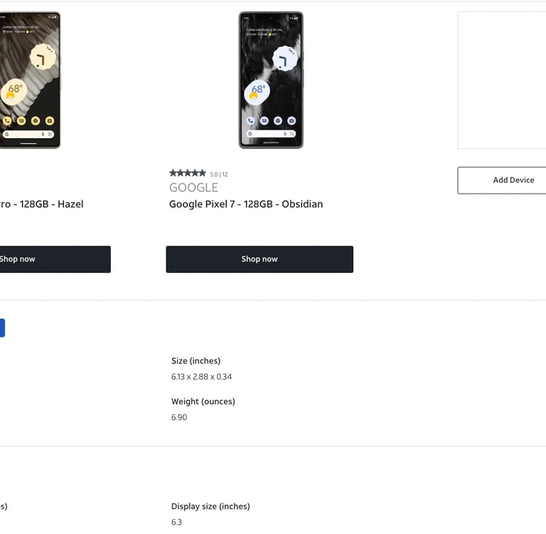
I discovered the best practices for comparison tools that I could apply to my designs.
Key Takeaways
By studying existing comparison tools, I found design elements that I wanted to adopt and ones that I wanted improve upon.
Ideation
After gathering inspiration, I began to ideate different ways of displaying the information.
While I discovered best practices by studying other product comparison tools, I realized that none of these solutions displayed a hierarchy of information. LaunchX would require a unique approach to display its 4 level hierarchy. While generating design ideas for displaying product information, I was focused on helping the user maintain context of what level of information they are viewing. Based on best practices and with the goal of minimizing mental load on the user, I considered the following factors:
1. Intuitiveness
2. Scalability
3. Structure
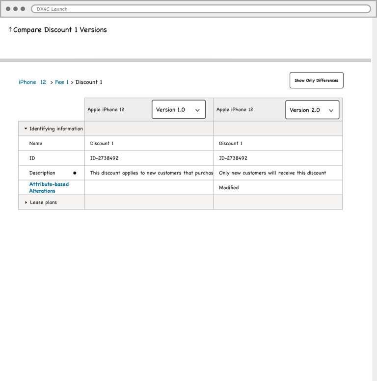
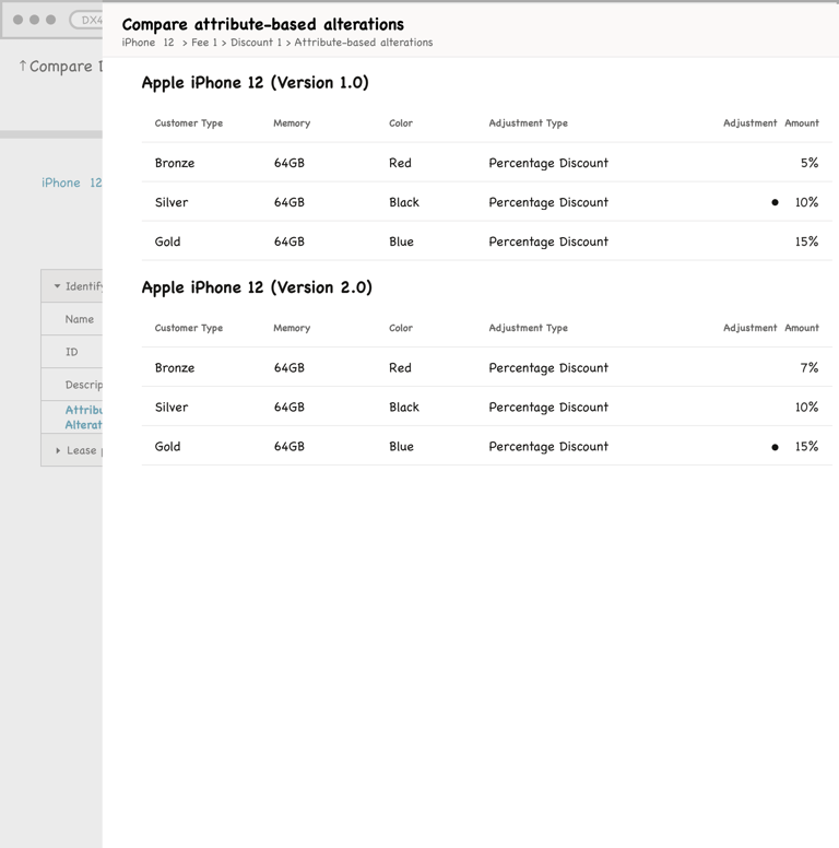
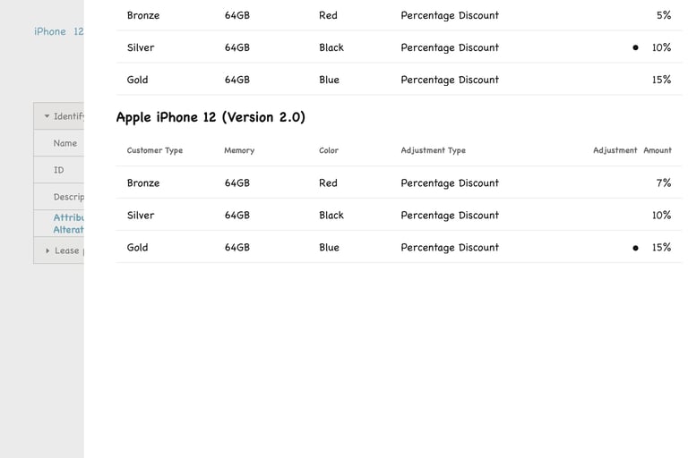
Exploration #2 - Interlinked tables to represent each level of the hierarchy

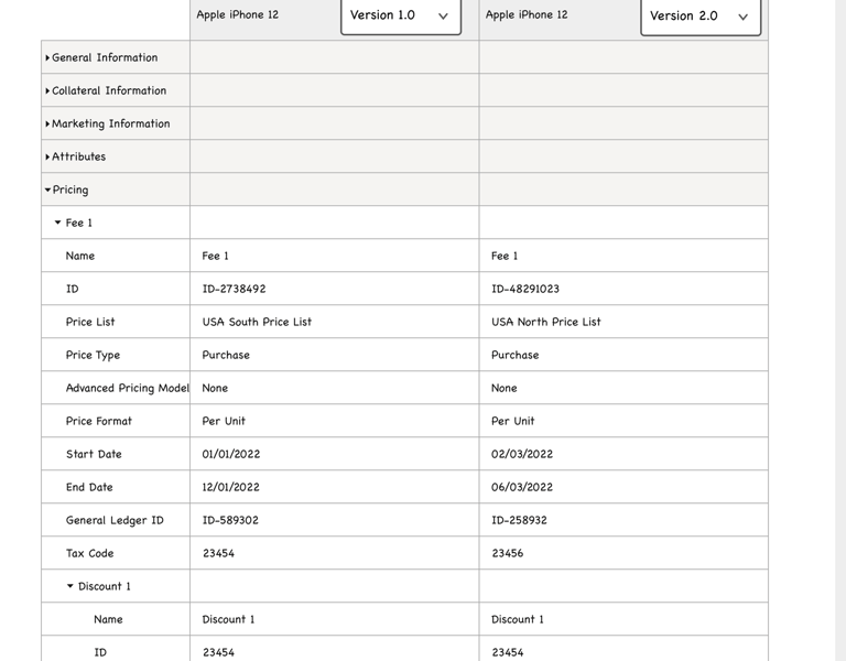
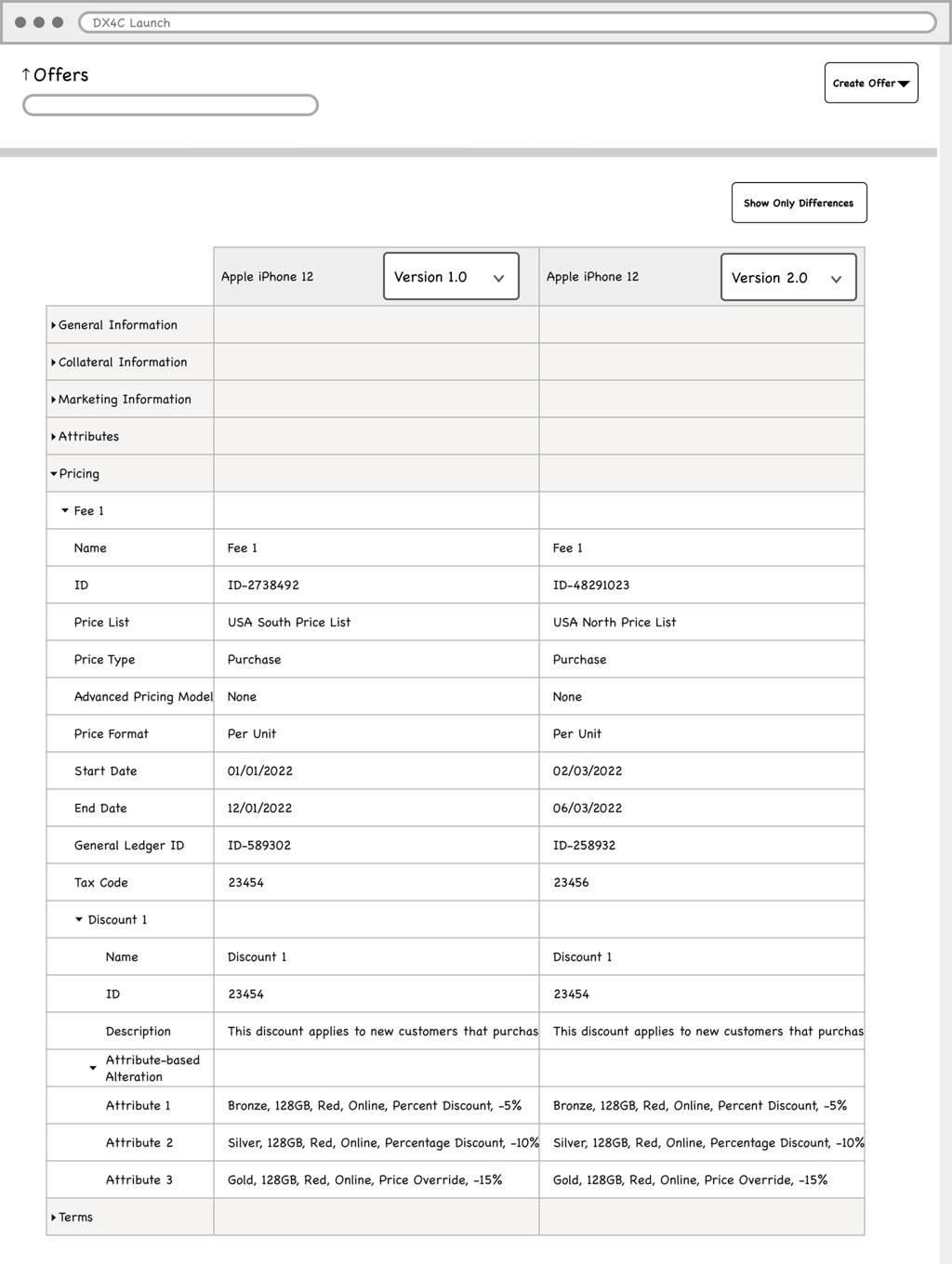
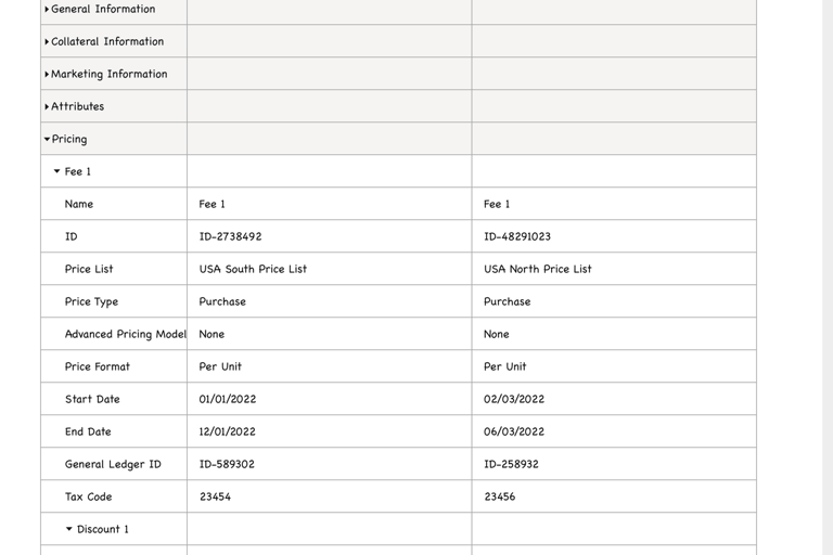
Exploration #1 - Single table with row expanders
Pros:
Information, at every level, can be quickly accessed by the user through row expanders
Cons:
Sub-component tables are displayed in a comma-separated format, in a single cell, which is challenging to interpret
Sheer amount of information = large mental load
Pros:
Users have control over what level of detail they want to view
The original structure of sub-component tables is preserved when displayed in a drawer
Cons:
Viewing separate pages for each level would require additional clicks
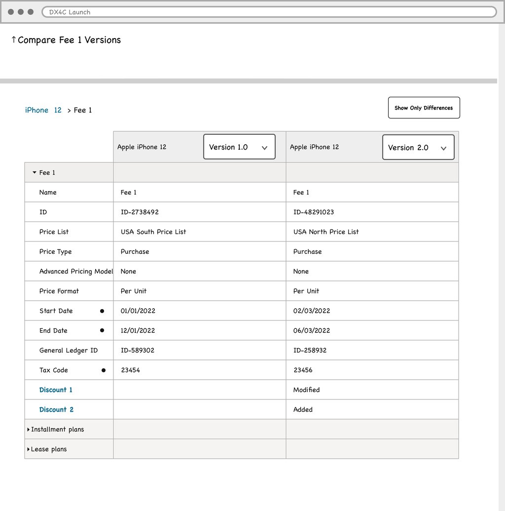
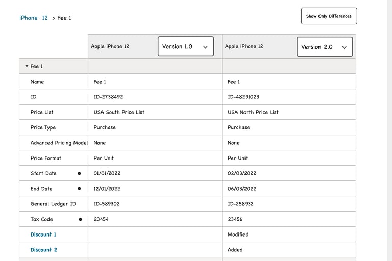
Exploration #3 - Highlight differences in the existing form
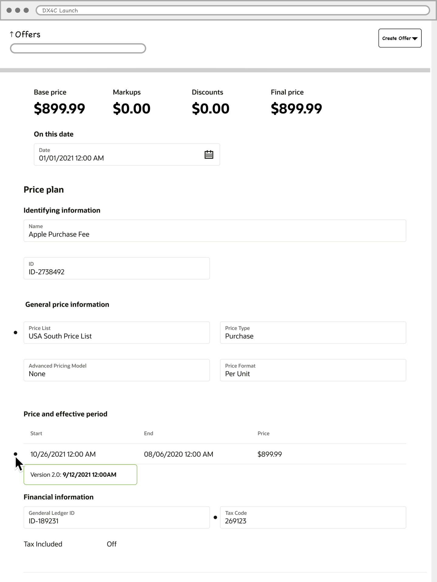
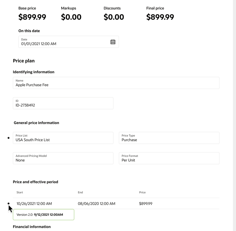
Pros:
Data is presented in the exact same format that the user is already familiar with
Cons:
User would have to scan for differences in the form = large mental load
After presenting my ideas to my team, I received the following feedback:
Exploration #1: Product manager expressed a strong concern with not being able to format sub-component tables inside of the comparison table, which could lead to confusion.
Exploration #2: Product manager found this design to be easy to understand and approved of how sub-component tables were displayed. The developer expressed no implementation concerns.
Exploration #3: Developer conveyed that a large development effort would be required to show differences within the form with no design pattern of this kind in existence.
Mockups
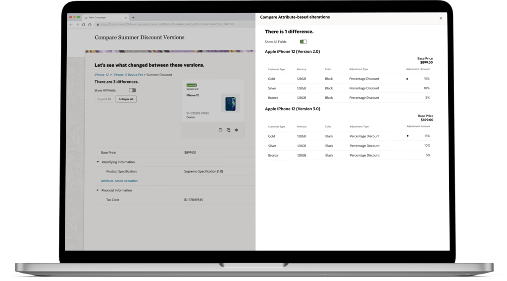
After the team came to an agreement to pursue exploration #2, I worked on creating mockups.
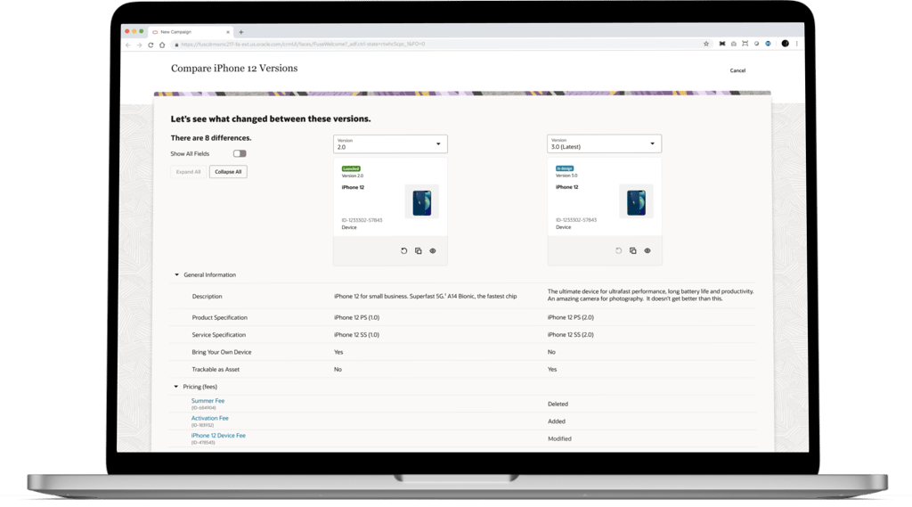
While creating mockups of the comparison table, I was able to use many existing components from the Oracle's Redwood Design System (ex. table cells, switch, buttons). After each design iteration, I held reviews with the lead designer, product manager, and developer to get feedback.
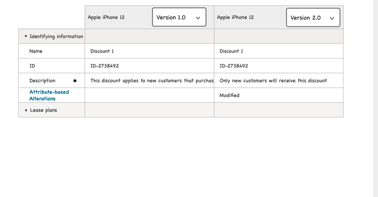
Iteration #2 - Improved interaction
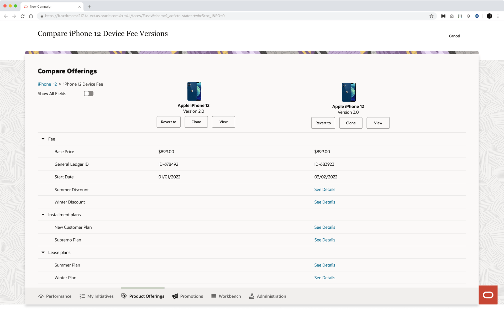
Iteration #1 - First iteration
Breadcrumbs allow the user to maintain context/navigate hierarchy.
Iteration #3 - Voice and tone
Hyperlink navigates user to the comparison table of the child component.
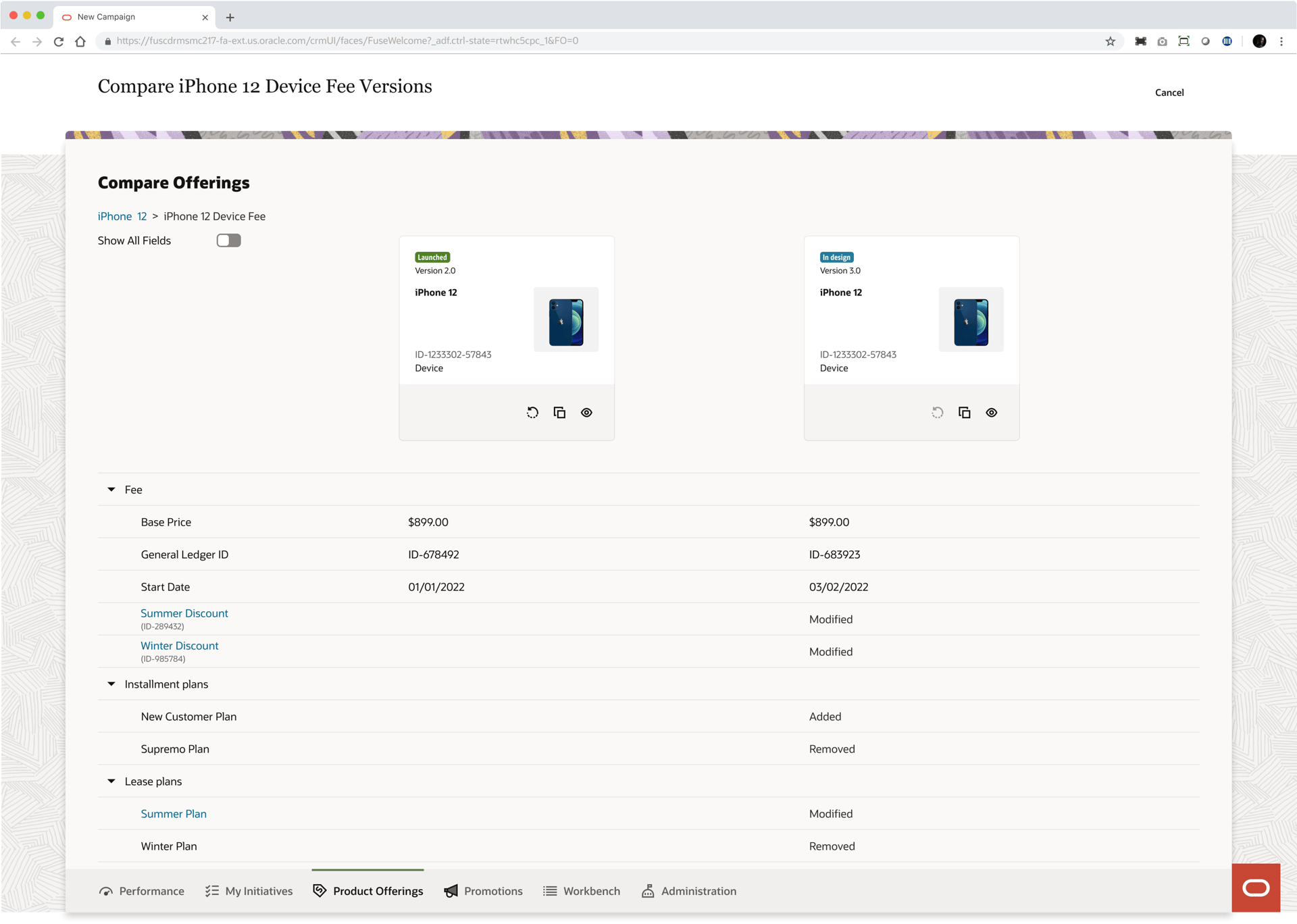
Breadcrumbs allow the user to maintain context/navigate hierarchy.
Hyperlink opens comparison table of the child component.
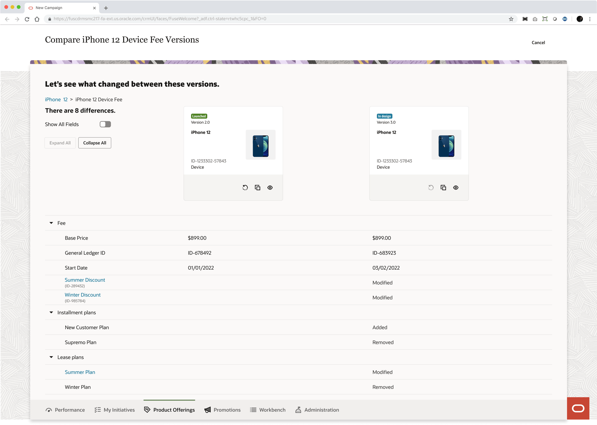
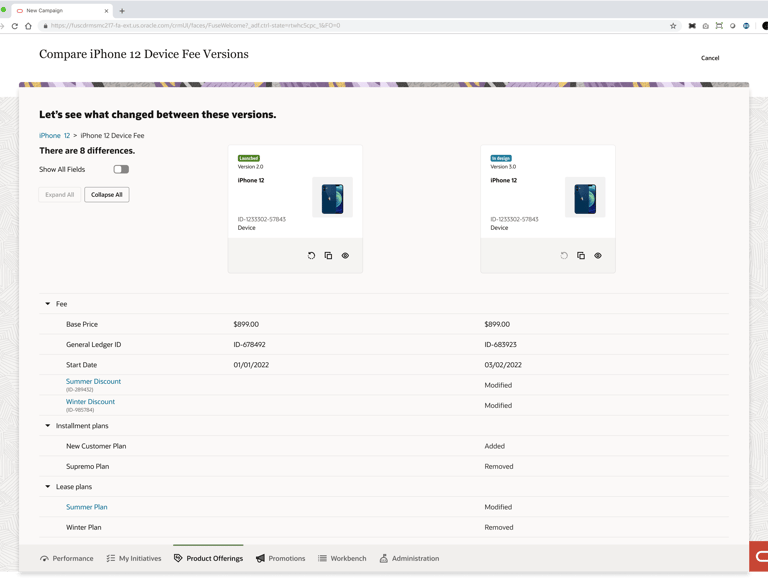
Quantity of differences provides the user with a sense of how different the versions are.
Final Design
Handoff to Development
As the final step of my design process, I held a Zoom meeting with the developer to present the designs of the comparison tool. During this time, I walked through my Figma prototype to showcase each screen of the user flow and explain how each component functions. For the technical details of my designs, I created a page in Confluence where I outlined every component, label, and heading used in my prototype.
After getting approval from the team on the design, I held a review meeting with the developer.
Final Thoughts and Considerations
What Went Well
Prior to this project I had never worked with such a large amount of data. The fact that the data was distributed over multiple levels made this design challenge even more complex. By thoroughly studying the data and by iterating multiple times, I was able to establish a new design pattern for displaying hierarchical data, not just for pricing but for other components as well.
What Could Have Gone Better
Gaining access to real, end users was a major challenge for this project and has been for the design team in general. Ideally, I would have included users throughout the various stages of my design process to get feedback that would guide my design decisions. Despite this obstacle, I feel that my team and I made the best of our limited resources by holding information sessions with the Oracle product manager to learn about our target user.
Next Steps
To help product managers determine whether a change is affecting the performance of their offering positively or negatively, I would try to incorporate an analytics feature. I envision that after a version gets launched, the system would collect data on how an offering is performing in the market. Based on this data, the system would provide recommendations on whether a specific configuration should be reverted to an older version.
