Trouvaiz
How I designed a responsive web app to increase bookings

Overview
Trouvaiz needs a way to make their platform accessible to more people.
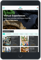
Trouvaiz, a Chicago-based startup, seeks to build a platform that allows people to book activities and classes from around the country. While the company founders initially intended to offer in-person activities, the COVID-19 pandemic influenced them to pivot to online experiences.
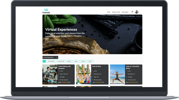
Trouvaiz currently has a iOS app, but no website, which has limited the number of customers that can access the company's platform. With the objective of reaching a wider audience and to increase the quantity of bookings, the co-founders commissioned me to design Trouvaiz's responsive web app.
My Role
As the lead UX designer, I was responsible for conducting user research and designing wireframes for their responsive web app. Throughout my process, I worked closely with a developer and the co-founders of Trouvaiz.
Role
UX designer
Team
Founders
Software developer
June - September 2020
Timeframe
User Research
I started my process by talking to travelers and individuals who book activities online.
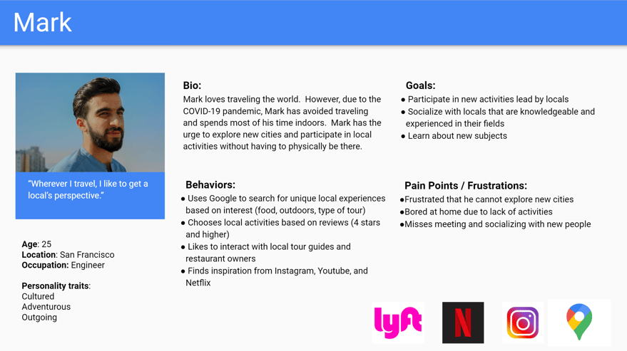
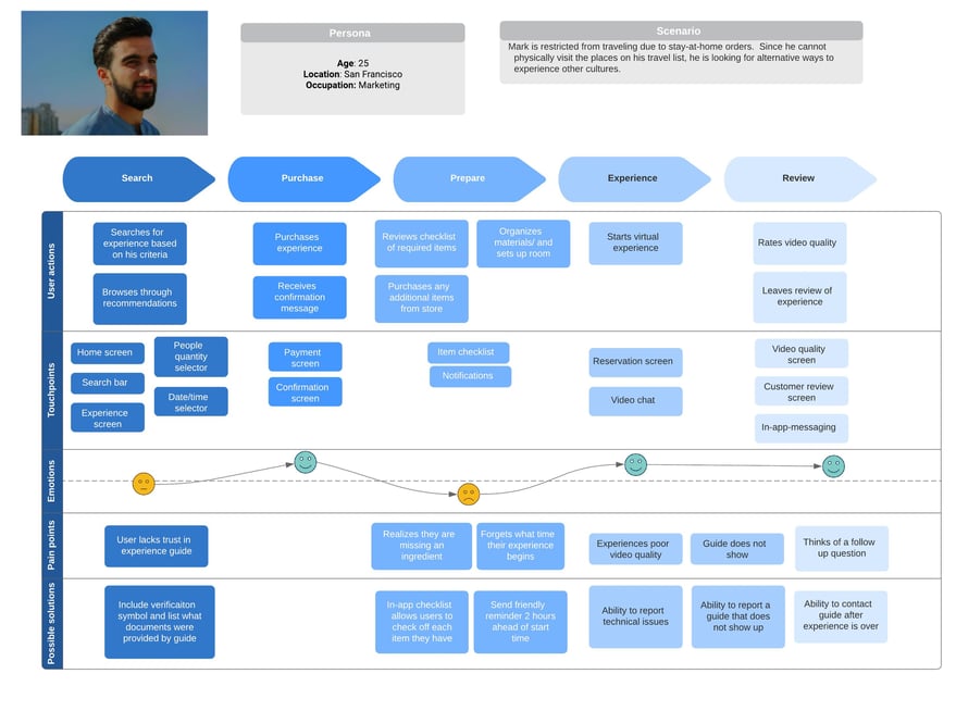
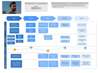
To understand the behaviors and needs of travelers/activity seekers, I interviewed various millennials between the ages of 20 - 26. With the information I collected, I created a user persona to not only help guide my own design decisions but also help the rest of the team empathize with the users. In addition to this, I used a user journey map to analyze the various pain points of booking experiences that could be addressed by Trouvaiz's platform.
Usability Testing
To ensure I was basing the website design off of a strong foundation, I had users test the current solution.
After finding out that the company had not conducted any previous usability tests with users on their existing iOS app, I took the initiative to organize my own tests with the same participants of my user interviews.
Goals of usability tests:
1. Identify any pain points in Trouvaiz's booking process
2. Evaluate the layout and content of the experience details page
3. Determine if any essential features were missing from the app
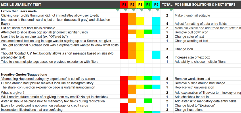
I utilized a rainbow spreadsheet to prioritize issues based on the number of occurrences and brainstorm potential solutions that could be addressed with the web app
There were some general UI issues, but no major obstacles that prevented users from completing their goals.
General UI Issues
1. Misleading Icons and Signifiers
Some users misinterpreted the meaning behind certain icons and signifiers on the app. For example, multiple users thought the bottom sheet for booking was collapsable by swiping down due to the visual design.
2. Difficulty Finding Ratings/Reviews
Users expressed frustration that the overall rating of the experience was not visible at the top of the screen. Based on the current layout, they had to scroll to the very bottom of the experience page to access the ratings and reviews.
3. Confusing Branding
Prior to testing, I had not considered asking participants about the company logo, however, multiple participants made comments about it. There was confusion with the relevance between the "W logo" and the name, Trouvaiz.
Information Architecture
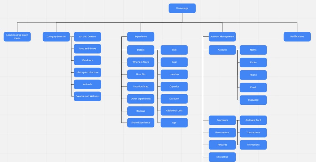
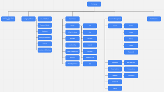
To organize the content of the web app, I carefully studied the information architecture of the mobile app.
Given that users did not run into any issues with the user flow or organization of the mobile app, I felt confident in applying the same information architecture to the website to ensure consistency across the website and native app. The site map not only helped organize my design, but also served as a visual aide for the freelance developer, who had no previous interaction with the mobile app.
Wireframes
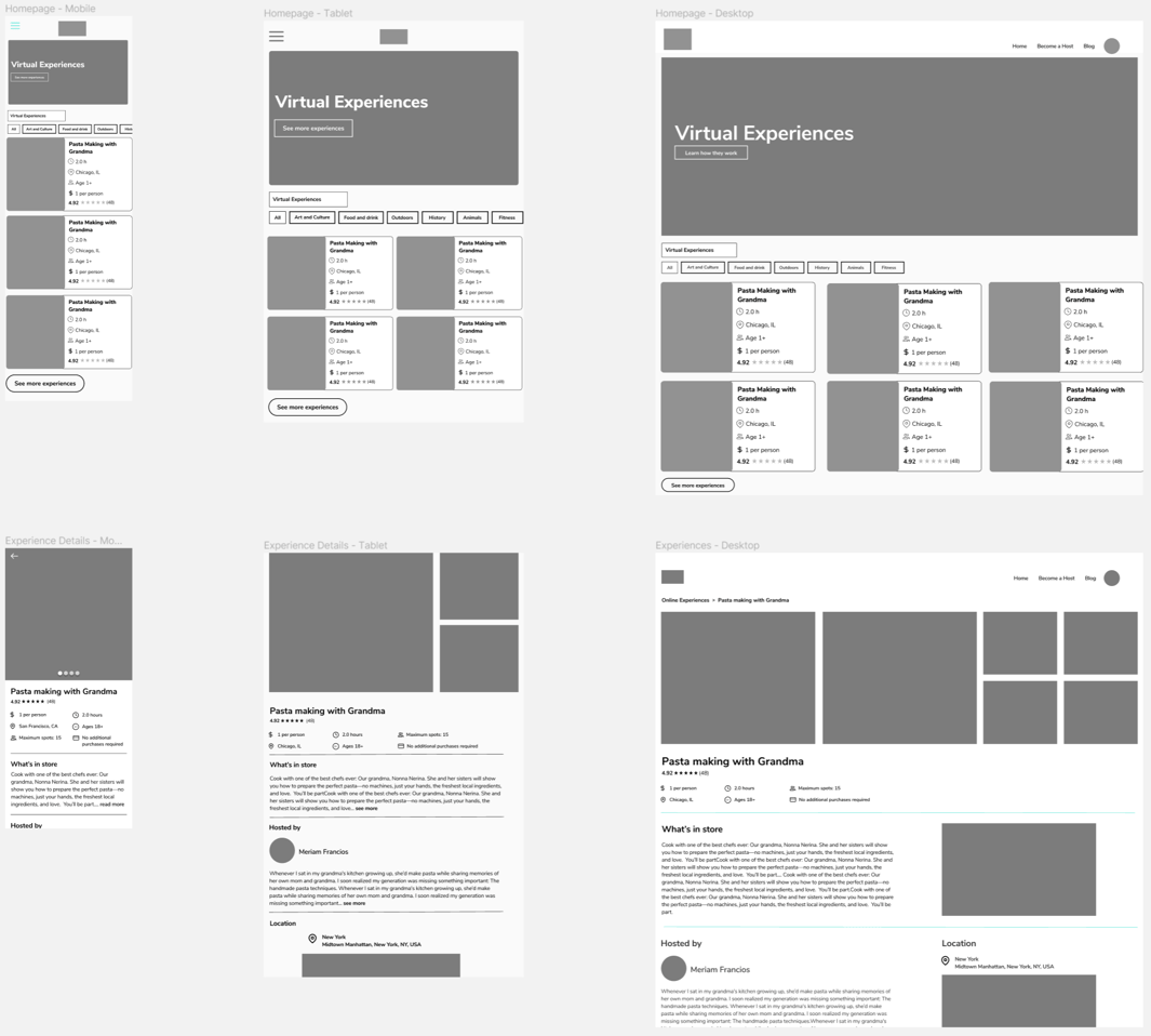
After analyzing the information architecture and user flows, I moved into sketching and designing wireframes.
Since I was working closely with a developer and the company founders, I decided to use Figma to design my wireframes. The browser based application and real-time collaboration feature allowed me to easily share my work and get quick feedback. At this point, I experimented with various breakpoint dimensions to find the optimal way to display the experience tiles and imagery.

High-Fidelity Mockups
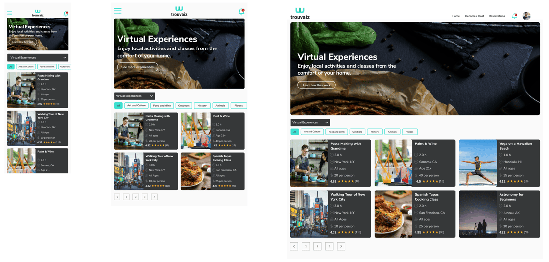
Once my stakeholders were satisfied with the design of my wireframes, I proceeded to create high-fidelity mockups.
To help the founders and developer visualize the look and feel of the end product, I applied the style guide I created for Trouvaiz including their existing color palette, text styles, and imagery. Once the founders were happy with the visual design, I transitioned into handing off my designs to the developer. At this point in the project, the developer had a good understanding of my designs, which made the implementation process smooth and successful.
Final Design
Final Thoughts and Considerations
What Went Well
Throughout this project, I learned how to effectively work with the business stakeholders and the developer to create a new product. I found this to be possible through open communication and keeping my work visible to everyone. By bouncing ideas off the developer from an early stage, I not only learned what ideas were feasible but also better ways of designing certain UI components.
What Could Have Gone Better
I initially faced communication and workflow challenges with the developer, as he began implementing my wireframes (in the shared Figma file) before they were finalized. Recognizing the inefficiency, I set up a meeting to align on our workflow and establish a process where I would notify him when designs were ready — resulting in a smoother collaboration.
Next Steps
Due to the scope and budget of the project, I only had the chance to work on the customer side of the Trouvaiz platform. If given me more time, I would look at the host interface since they have their own unique needs and motivations. I would specifically look at the user flows that pertain to creating and managing experiences on the platform.
After wrapping up this project, I reflected on my work and what I learned.
© 2025 by Scott Wong
